> ## Documentation Index
> Fetch the complete documentation index at: https://docs.gleap.io/llms.txt
> Use this file to discover all available pages before exploring further.
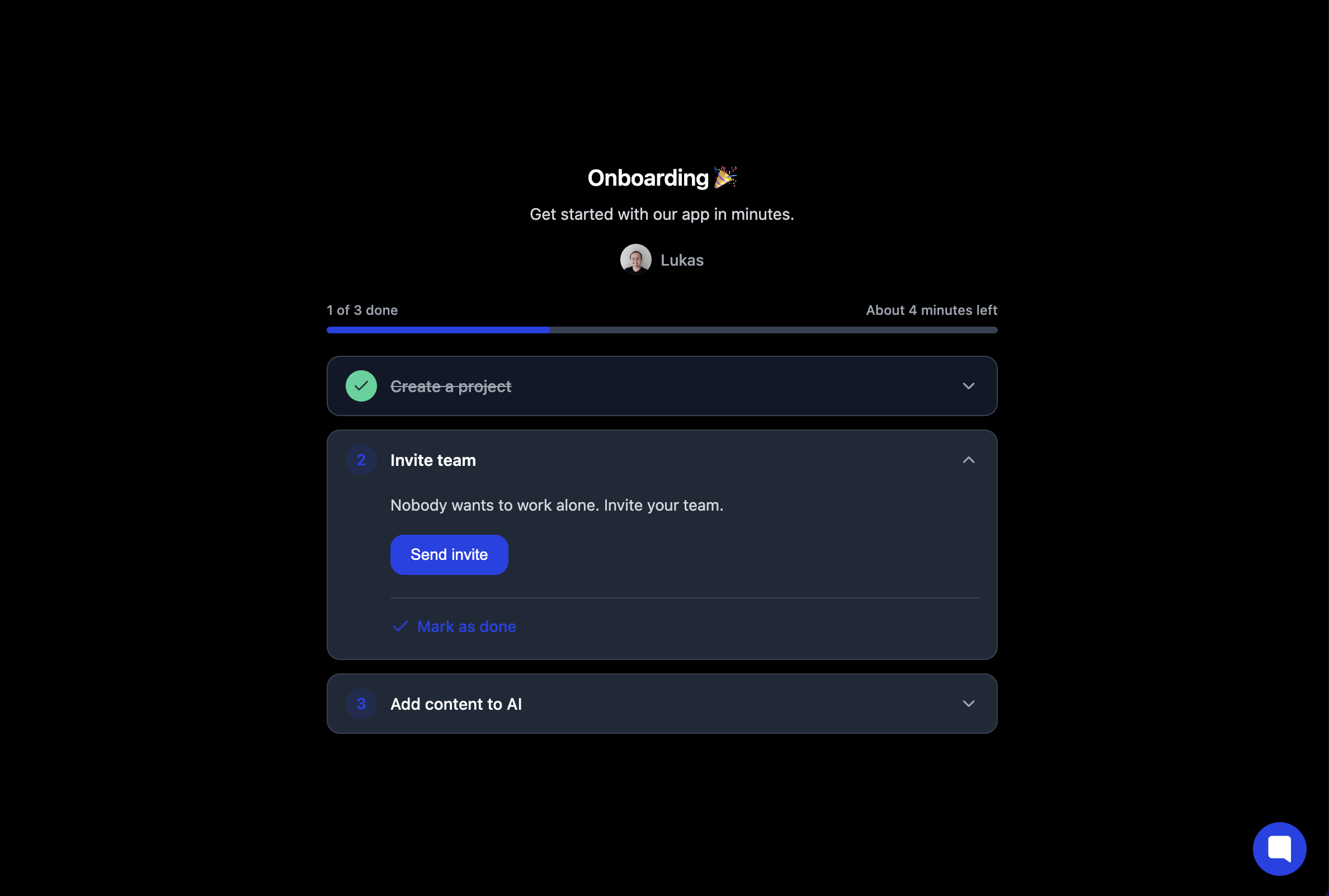
# Checklist UI component
We have designed ready to use components for Gleap checklists. You can directly embed those components into your web-apps, which makes them super powerful and increases checklist usage for onboardings a lot.
## Usage
Import the Gleap SDK in your app. This will register a custom web component.
You can then add the following web component to your app, to display your desired checklist.
```js theme={null}
```
Simply replace the CHECKLIST\_ID\_GOES\_HERE with the ID of your checklist.
### Available attributes
*checklistId*: This is the ID of your checklist
*info*: Show / hide the info label
*progressbar*: Show / hide the progress bar
*dark*: Toggle dark mode
*floating*: Enable floating mode
*sharedKey*: Sync a checklist accross resources
### Shared key
Use the `sharedKey` property to **synchronize checklist progress across multiple resources**.\
When any user updates a checklist that has the same `sharedKey`, everyone else—no matter which widget, page, or device they’re on—will immediately see the updated status.
* **Collaboration made easy** | Perfect for project dashboards, sprint boards, or any place where several people need to track a single source‑of‑truth checklist.
* **One key, one state** | All instances that share the key stay in lock‑step; remove the key and each checklist becomes independent again.
* **Zero extra code** | Just add the same `sharedKey` value wherever you want progress to be shared.
Pick a descriptive key (e.g., `project-128374`) so it’s clear what the checklist represents.
### Floating checklist component
If you want to add the checklist to the navbar or sidebar, just enable the floating option by adding the floating attribute.
```js theme={null}
```
### Dark mode
You can toggle the dark mode by adding the `dark="true"` attribute.
 ## TypeScript (React, Vue, Angular)
To enable full TypeScript support for the `` custom element, add the following declaration to your `global.d.ts` file:
```ts theme={null}
declare global {
namespace JSX {
interface IntrinsicElements {
"gleap-checklist": React.DetailedHTMLProps<
React.HTMLAttributes,
HTMLElement
> & {
floating?: string;
dark?: string;
info?: string;
progressbar?: string;
checklistid?: string;
sharedKey?: string;
};
}
}
}
export {};
```
This ensures proper type checking and IntelliSense when using the custom
element in your JSX.
## Custom CSS
The `` component uses **Shadow DOM** to encapsulate its internal styles. To allow customization, it exposes specific elements via the `part` attribute.
You can override these styles globally using the `::part()` pseudo-element.
### Example
```css theme={null}
gleap-checklist::part(info-title) {
color: #9e87e8;
font-size: 20px;
}
gleap-checklist::part(progress-bar-progress) {
background-color: #9e87e8;
}
```
Replace colors and styles as needed to match your brand.
### Available parts
| Part name | Description |
| -------------------------- | --------------------------------------- |
| `content` | Wrapper of the entire checklist content |
| `info` | Section with title, description, sender |
| `info-title` | Checklist title |
| `info-description` | Subtitle/description text |
| `sender` | Sender container |
| `sender-image` | Sender profile image |
| `sender-name` | Sender name |
| `progress-labels` | Labels showing progress information |
| `progress-label-primary` | Main progress label |
| `progress-label-secondary` | Secondary progress label |
| `progress-bar` | Container for the progress bar |
| `progress-bar-progress` | The inner fill of the progress bar |
| `tasks` | Container for all tasks |
| `task` | Wrapper for a single task |
| `task-header` | Clickable task header |
| `task-badge` | Task number badge |
| `task-header-title` | Task title text |
| `task-header-chevron` | Chevron icon for expand/collapse |
| `task-body` | Expandable container for task content |
| `task-body-inner` | Inner container inside task body |
| `task-body-content` | Descriptive text inside task body |
| `task-action` | Container for action buttons |
| `task-mark-done` | Container for the "Mark as done" action |
## TypeScript (React, Vue, Angular)
To enable full TypeScript support for the `` custom element, add the following declaration to your `global.d.ts` file:
```ts theme={null}
declare global {
namespace JSX {
interface IntrinsicElements {
"gleap-checklist": React.DetailedHTMLProps<
React.HTMLAttributes,
HTMLElement
> & {
floating?: string;
dark?: string;
info?: string;
progressbar?: string;
checklistid?: string;
sharedKey?: string;
};
}
}
}
export {};
```
This ensures proper type checking and IntelliSense when using the custom
element in your JSX.
## Custom CSS
The `` component uses **Shadow DOM** to encapsulate its internal styles. To allow customization, it exposes specific elements via the `part` attribute.
You can override these styles globally using the `::part()` pseudo-element.
### Example
```css theme={null}
gleap-checklist::part(info-title) {
color: #9e87e8;
font-size: 20px;
}
gleap-checklist::part(progress-bar-progress) {
background-color: #9e87e8;
}
```
Replace colors and styles as needed to match your brand.
### Available parts
| Part name | Description |
| -------------------------- | --------------------------------------- |
| `content` | Wrapper of the entire checklist content |
| `info` | Section with title, description, sender |
| `info-title` | Checklist title |
| `info-description` | Subtitle/description text |
| `sender` | Sender container |
| `sender-image` | Sender profile image |
| `sender-name` | Sender name |
| `progress-labels` | Labels showing progress information |
| `progress-label-primary` | Main progress label |
| `progress-label-secondary` | Secondary progress label |
| `progress-bar` | Container for the progress bar |
| `progress-bar-progress` | The inner fill of the progress bar |
| `tasks` | Container for all tasks |
| `task` | Wrapper for a single task |
| `task-header` | Clickable task header |
| `task-badge` | Task number badge |
| `task-header-title` | Task title text |
| `task-header-chevron` | Chevron icon for expand/collapse |
| `task-body` | Expandable container for task content |
| `task-body-inner` | Inner container inside task body |
| `task-body-content` | Descriptive text inside task body |
| `task-action` | Container for action buttons |
| `task-mark-done` | Container for the "Mark as done" action |