> ## Documentation Index
> Fetch the complete documentation index at: https://docs.gleap.io/llms.txt
> Use this file to discover all available pages before exploring further.
# AI chatbar
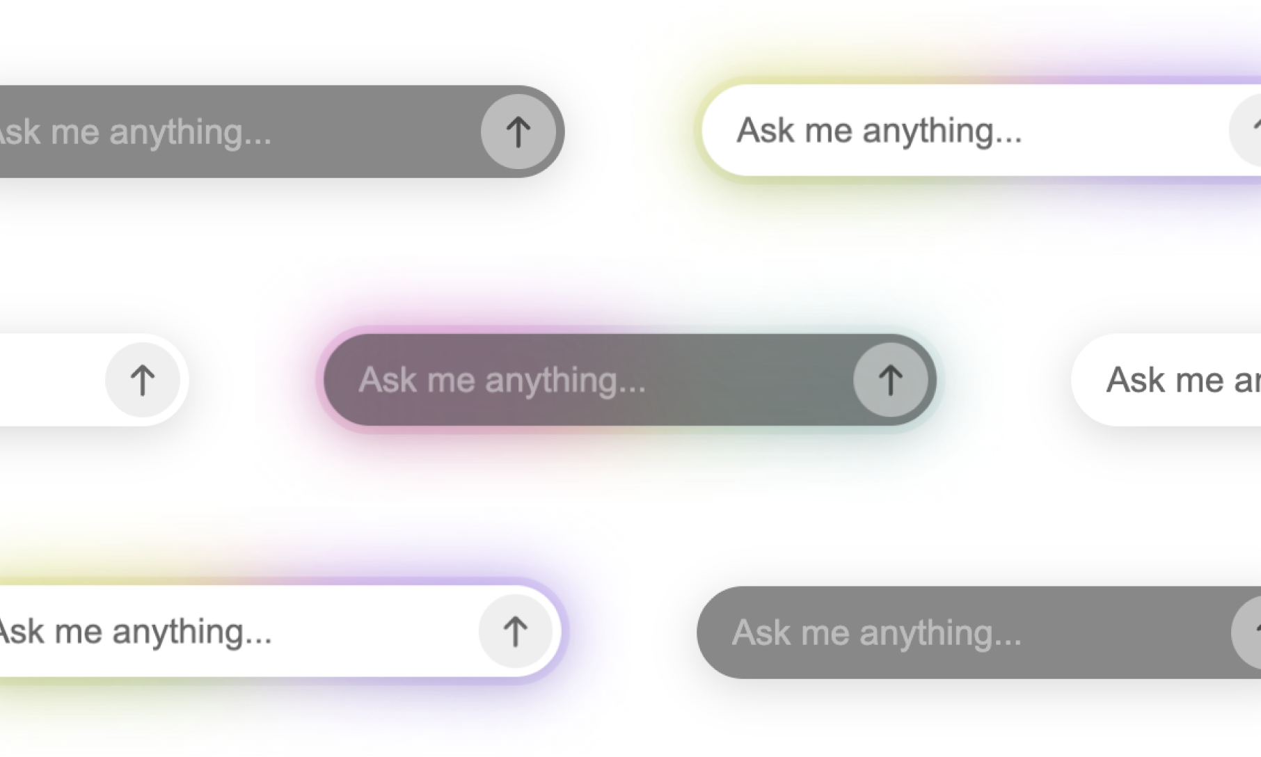
The AI chatbar is an inline assistant that lets visitors ask questions on any page. It appears automatically once the SDK is initialized.
## `Gleap.showAiChatbar()`
Show the chatbar.
```js theme={null}
Gleap.showAiChatbar();
```
## `Gleap.hideAiChatbar()`
Hide the chatbar.
```js theme={null}
Gleap.hideAiChatbar();
```
## `Gleap.setAiChatbarQuickActions(quickActions)`
Set the suggested action buttons shown above the input.
```js theme={null}
Gleap.setAiChatbarQuickActions([
"How do I reset my password?",
"Contact support",
"Check system status",
]);
```
## `Gleap.setAiChatbarPlaceholder(placeholder)`
Override the input placeholder text.
```js theme={null}
Gleap.setAiChatbarPlaceholder("Ask about billing...");
```
## Customizing the appearance
The chatbar renders inside a [Shadow DOM](https://developer.mozilla.org/en-US/docs/Web/API/Web_components/Using_shadow_DOM) for style isolation. Override styles from outside using CSS `::part()`. The host element has class `gleap-ai-ui-widget`.
| Part | Description |
| ------------------ | ----------------------------------- |
| `container` | Outermost container |
| `input-container` | Wrapper around the input field |
| `input-background` | Blurred background behind the input |
| `input` | The `` text field |
| `send-button` | The send button |
| `quick-actions` | The quick actions row |
```css theme={null}
.gleap-ai-ui-widget::part(input-background) {
background: #1a1a1a;
}
.gleap-ai-ui-widget::part(input) {
color: #ffffff;
font-size: 14px;
}
.gleap-ai-ui-widget::part(send-button) {
background: #6c47ff;
}
```
 ## `Gleap.showAiChatbar()`
Show the chatbar.
```js theme={null}
Gleap.showAiChatbar();
```
## `Gleap.hideAiChatbar()`
Hide the chatbar.
```js theme={null}
Gleap.hideAiChatbar();
```
## `Gleap.setAiChatbarQuickActions(quickActions)`
Set the suggested action buttons shown above the input.
```js theme={null}
Gleap.setAiChatbarQuickActions([
"How do I reset my password?",
"Contact support",
"Check system status",
]);
```
## `Gleap.setAiChatbarPlaceholder(placeholder)`
Override the input placeholder text.
```js theme={null}
Gleap.setAiChatbarPlaceholder("Ask about billing...");
```
## Customizing the appearance
The chatbar renders inside a [Shadow DOM](https://developer.mozilla.org/en-US/docs/Web/API/Web_components/Using_shadow_DOM) for style isolation. Override styles from outside using CSS `::part()`. The host element has class `gleap-ai-ui-widget`.
| Part | Description |
| ------------------ | ----------------------------------- |
| `container` | Outermost container |
| `input-container` | Wrapper around the input field |
| `input-background` | Blurred background behind the input |
| `input` | The `` text field |
| `send-button` | The send button |
| `quick-actions` | The quick actions row |
```css theme={null}
.gleap-ai-ui-widget::part(input-background) {
background: #1a1a1a;
}
.gleap-ai-ui-widget::part(input) {
color: #ffffff;
font-size: 14px;
}
.gleap-ai-ui-widget::part(send-button) {
background: #6c47ff;
}
```
## `Gleap.showAiChatbar()`
Show the chatbar.
```js theme={null}
Gleap.showAiChatbar();
```
## `Gleap.hideAiChatbar()`
Hide the chatbar.
```js theme={null}
Gleap.hideAiChatbar();
```
## `Gleap.setAiChatbarQuickActions(quickActions)`
Set the suggested action buttons shown above the input.
```js theme={null}
Gleap.setAiChatbarQuickActions([
"How do I reset my password?",
"Contact support",
"Check system status",
]);
```
## `Gleap.setAiChatbarPlaceholder(placeholder)`
Override the input placeholder text.
```js theme={null}
Gleap.setAiChatbarPlaceholder("Ask about billing...");
```
## Customizing the appearance
The chatbar renders inside a [Shadow DOM](https://developer.mozilla.org/en-US/docs/Web/API/Web_components/Using_shadow_DOM) for style isolation. Override styles from outside using CSS `::part()`. The host element has class `gleap-ai-ui-widget`.
| Part | Description |
| ------------------ | ----------------------------------- |
| `container` | Outermost container |
| `input-container` | Wrapper around the input field |
| `input-background` | Blurred background behind the input |
| `input` | The `` text field |
| `send-button` | The send button |
| `quick-actions` | The quick actions row |
```css theme={null}
.gleap-ai-ui-widget::part(input-background) {
background: #1a1a1a;
}
.gleap-ai-ui-widget::part(input) {
color: #ffffff;
font-size: 14px;
}
.gleap-ai-ui-widget::part(send-button) {
background: #6c47ff;
}
```